Most accurate & fastest address verification
Smarty is simply the best solution for USPS and International Address Validation. From our APIs, to our list-processing tools, we have an address validation solution for you.
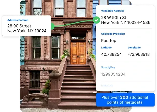
Address validation tools
Single Address Verification
Bulk Address Validation
US property data
Get marketing insights, analyze risk, and unlock ROI with 350 property attributes on most US addresses.
Property attributes include:
- 150 structure property attributes
- 60 location property attributes
- 130 financial property attributes
Smarty's US Property Data is available through our US Address Enrichment API. It's cloud-native, lightning-fast, hyper-accurate (with monthly updates), and backed by Smarty's legendary support team.
US rooftop geocoding
Geocoding transforms addresses into lat/long coordinates. We provide hyper-accurate geocoding at blazing speeds. All for a fixed price.
Get More Details
Trusted by companies like
See our Customers
Proud to be #1


Fast, easy, and reliable
Our simple API documentation and fantastic customer support make it easy to start validating addresses in just a few minutes.
Get rolling in minutes
No credit card required. Get 1,000 free lookups. Try out the full demo before signing up.
100% up-time
Our service averages (drumroll please)…100% up-time!
Every address on the planet
From Tokyo to Toronto and everywhere in between. Verify addresses with our USPS and International address validation APIs.
Customer-loving support
Talk with real people who love helping you.
Ridiculously good documentation
Comprehensive and easy-to-digest documentation. From our address validation APIs to our List Processing Tools, every detail you need is right here.
Guaranteed data security
24 hour monitoring, encryption, and hashed. And we swallowed the key.
Transparent pricing
Simple pricing. No setup fees, commitments, or gimmicks.
Really fast
There's fast and then there's Smarty fast. Our service averages sub-30 millisecond response time.
Ready to get started?